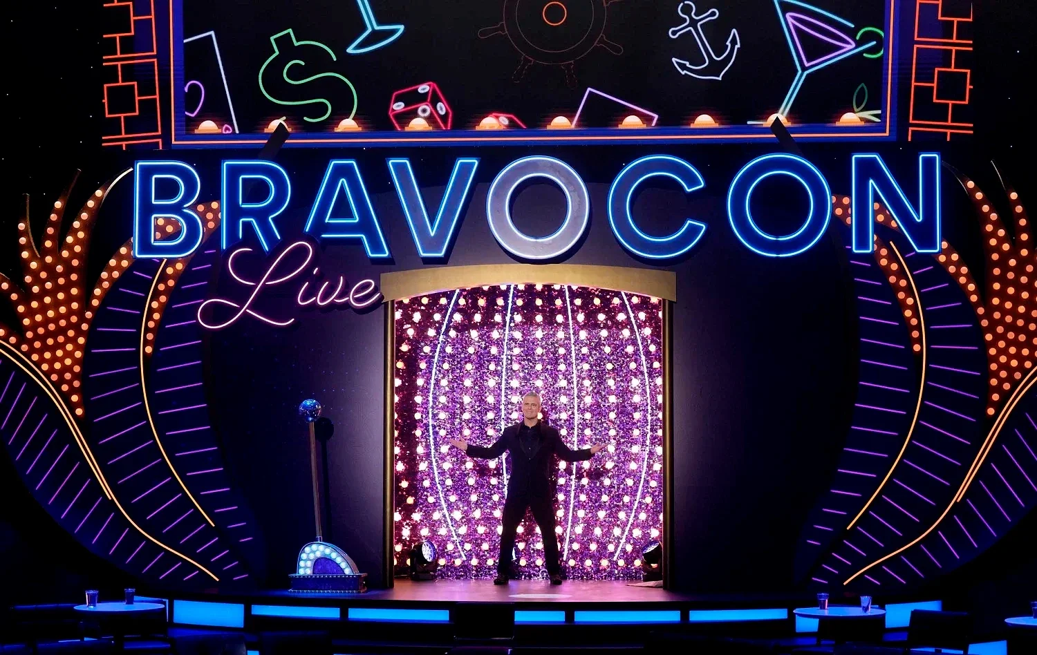
Color Me BravoCon
Client: Creative Riff / CALIA x BravoCon
Role: Freelance Creative Director, Experiential Design, Graphic Design
While freelancing with Creative Riff, I supported the BravoCon creative system across event branding elements, helping extend the look and feel into fan facing touchpoints built for high energy, high volume moments.
In parallel, I led concept and experience development for CALIA’s fan activation, Color Me BravoCon, turning the seasonal color consultation trend into a Bravo ready style moment. The goal was simple: make every guest feel like the main character while connecting confidence and comfort to color and personal style, through CALIA.
I shaped the end to end activation from creative direction to guest journey, including the visual language, environment touchpoints, and a modular footprint designed. With playful Bravo nods and fashion forward polish, the experience was built to be flexible on site, easy to elevate or simplify, and inherently shareable so every guest leaves with a clear CALIA story and a look that feels made for their BravoCon spotlight.
Role: Creative Director, Designer
Agency: Y&R New York
Collaborators:
Copywriter: Deanna Director
Illustrator: Lee Trice
Digital Production: VML
Project: Who Likes, Likes You – Facebook Valentine’s Day App
Overview: To make Valentine’s Day a little more revealing (and fun), we created a cheeky Facebook app that analyzed user engagement to reveal your top digital admirer—your #1 "Facebook stalker." The experience struck the perfect mix of humor, intrigue, and social connectivity, earning industry buzz and driving user engagement during the holiday.
Contribution:
Led creative direction and app concept
Designed the full visual identity and UI elements
Collaborated closely with VML to bring the digital experience to life
Recognition:
Featured in Forbes, Creativity Online, AdWeek, and AgencySpy
Entered in Cannes Lions 2012
Find your Facebook Valentine here!
Production:
Copywriter-Deanna Director
Illustrator-Lee Trice
Digital-VML
Client: MTV / Paramount Networks
Role: Creative Lead
To relaunch The Hills for a new generation, I joined Paramount’s high-impact internal team, EPIC PRIORITY. Our task was to reignite nostalgia for longtime fans while capturing the attention of Gen Z audiences—bridging eras through bold creative.
We led a 360° campaign spanning digital, social, streaming, and on-air. From polished trailers to platform-native assets and influencer-driven moments, every piece of creative was tailored to maximize relevance and reach. The campaign ran across MTV and Paramount+, with distinct formats for each audience.
To amplify buzz, we launched a guerrilla-style activation with surprise Hills-branded moments in public spaces boosting shareability and reinforcing cultural presence.
This cross-platform rollout balanced legacy with modern relevance, proving EPIC PRIORITY’s ability to deliver inventive, culture-forward work with impact.
Client: Double Platinum, Inc.
Role: Art Director & Designer
For the debut album of Dumblonde—the electropop duo formed by Aubrey O'Day and Shannon Bex following the Danity Kane split I was brought on to develop the visual identity from the ground up.
My role included designing the album cover artwork and logo, both of which helped define the duo’s reintroduction to the music scene. The design direction embraced minimalism with bold, edgy undertones, reflecting the group’s reinvention and unapologetic energy. The aesthetic marked a clear departure from their previous group identity, signaling a more experimental and fashion-forward chapter.
This project was an exercise in blending music, branding, and visual storytelling to support a fresh start for two seasoned performers ready to take creative control.
Client: VERSACE
Role: Art Direction, Design, Strategy, Experiential
While working with the Events team at Versace, I served as a Art Director, leading the design and development of immersive brand experiences for offline events and retail moments. One of the most notable collaborations during my tenure was the Versace x Haas Brothers partnership, where bold design and surreal art collided with high fashion.
I contributed to the creative direction, event design, and retail strategy, crafting visually compelling spaces that merged Versace’s signature opulence with the Haas Brothers’ playful, sculptural aesthetic. From fashion presentations and exclusive shopping events to window installations and branded touchpoints, I helped bring the collaboration to life through detailed, narrative-rich design.
My work extended beyond visuals—shaping copywriting, customer journey strategy, and the tone of the full branded experience—ensuring each event felt intentional, elevated, and unforgettable.
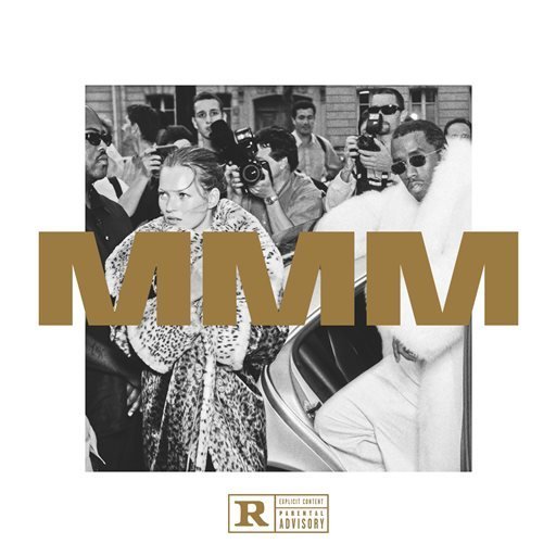
Client: Bad Boy Records
Role: Creative Director & Designer
For the release of Puff Daddy’s MMM album, I led the creative direction and design of apparel and promotional assets that amplified the album’s gritty, cinematic tone. Inspired by the raw energy of New York street hustle and the legendary Money Making Mitch narrative, the visuals fused luxury with streetwear attitude.
My contributions spanned graphic design, product design, and merchandising strategy, resulting in a cohesive brand presence across apparel drops, digital rollouts, and pop-up activations. Each touchpoint reflected the legacy of Bad Boy while reintroducing Puff Daddy to a new generation of fans through bold, design-forward storytelling.
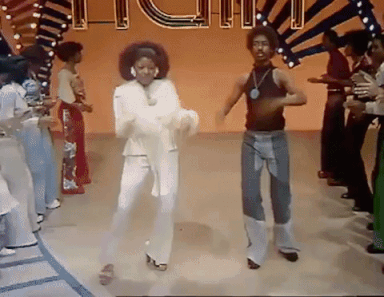
Client: BET
Role: Art Director & Designer
Motion Animator-Luis Moya
Writer/Producer- Jo-Well Paupaw
“Prepare for the hippest trip in America.” That iconic Soul Train slogan became the foundation for a visual campaign that honored the psychedelic spirit of the 1970s while tapping into the emotional and aspirational journey of the series’ characters.
Inspired by the era’s vibrant visuals and altered states, we leaned into a design aesthetic that felt immersive and euphoric expressing what it might feel like to be transported by music, ambition, and the dream of connection. Through a mix of layered textures, swirling colors, and surreal compositions, we brought the subconscious experiences of each character to life.
The campaign spanned TV promo, print, and digital executions, inviting viewers into a soulful, dreamlike universe shaped by the pulse of Black culture and the legacy of Don Cornelius who connected communities through dance, music, and bold self-expression.
AWARDS: Art Direction & Design
2021 CLIOS InHouse Design- BRONZ
2021 PROMAX Multiplatform Program Image- GOLD
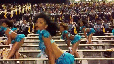
Project: BLACK GIRLS ROCK!
Role: Creative Direction, Art Direction, Design Strategy
Overview:
BLACK GIRLS ROCK! is a multifaceted media, entertainment, and philanthropic brand that celebrates the empowerment and achievements of Black women and girls across music, medicine, politics, arts, and activism.
For the 2019 awards ceremony, we honored the spectrum of truth-tellers who protect legacy. Drawing inspiration from the militant-chic style of the Black Panther movement and the graphic work of Emory Douglas, we created a bold visual language rooted in resistance, pride, and cultural power. The aesthetic reimagined 60s and 70s revolutionary art through a modern lens, positioning Black womanhood not as a symbol of victimhood—but as a force of unapologetic strength and beauty.
Role: Creative Director & Designer
Platform: BET Networks/BET +/Paramount +
Writer/producer- Kara Barnett
Graphic designer- Lia Strasser
Creative Director (copy)- Jerome Ford
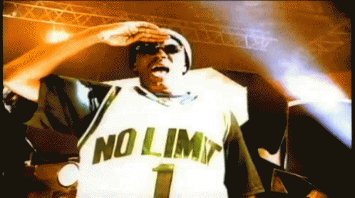
No Limit Chronicles tells the story of Master P—his rise from independent hustle to cultural icon, and the empire he built through ownership, vision, and community. As Creative Director, I developed a visual campaign that honored that legacy by leaning into the aesthetic that fueled the No Limit brand: bold, brash, unapologetically Southern.
Creative Approach
To ground the series in authenticity and cultural relevance, I drew inspiration from early 2000s Pen & Pixel design—the legendary Southern design house behind many of hip-hop’s most iconic album covers. Gold fonts, icy textures, stacked money, and gritty gradients were intentionally exaggerated to reflect the high-energy, DIY glamour of that era. This visual language became the cornerstone of the campaign’s identity across print, digital, motion, and merchandise.
Merchandising & Cultural Impact
A major component of the campaign was the limited-edition merch drop—designed as a collector’s capsule for fans of No Limit and hip-hop history. The merch not only paid homage to the style of the era, but also gave fans a tangible piece of the movement, extending the campaign into streetwear culture.
Scope of Work
Visual concept and art direction
Graphic design rooted in early 2000s Southern hip-hop aesthetic
Custom merchandise and apparel design
Promo materials for linear, digital, and social platforms
Campaign rollout for the Chronicles docuseries franchise
Client: BET/Murder INC Records
Role: Art Director
Designer/Motion Animator: Luis Moya
I served as Art Director for The Murder Inc Story, a BET docuseries chronicling the rise, fall, and legacy of one of hip-hop’s most influential labels. I worked closely with Murder Inc Records to ensure the visuals authentically reflected the label’s cultural impact and iconic story.
My contributions included designing the key art, leading the promo campaign, and executing a refreshed logo that modernized the Murder Inc identity while honoring its original grit and legacy. From on-air spots to digital and social assets, I helped shape a visual language that captured the high stakes, ambition, and drama that defined the era.
Client: BET Networks
Role: Creative Director & Designer
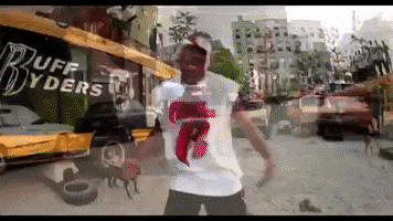
For Ruff Ryders: Chronicles, we set out to build a campaign that felt raw, reverent, and grounded in cultural truth. Inspired by the cut-and-paste collage style of the late '90s and early 2000s, the design approach was intentionally unpolished and pulled from archival footage, personal photos, vintage stock imagery, and street materials to create something that felt organically sourced and deeply authentic.
The result was a visual campaign that felt like it came straight from the community itself—part inspiration board, part memory wall. That organic aesthetic wasn’t just a style choice; it was a strategy to reflect the grassroots energy that defined the Ruff Ryders movement.
A major pillar of the campaign was a robust merchandise push. The raw, layered visuals translated seamlessly into apparel, resulting in a series of t-shirts, hoodies, and lifestyle pieces that honored the legacy of the brand while tapping into the nostalgic streetwear revival. The key art and symbolic elements were intentionally designed with merch in mind, allowing fans to literally wear the story.
The creative concept extended to symbolic storytelling as well. Animals were used as visual metaphors throughout, like the pit bull to represent DMX’s raw intensity, or the scorpion to reflect Eve’s sharp, stylish strength. These icons helped personify the distinct energies within the Ruff Ryders family, adding an allegorical layer to the campaign.
Altogether, the campaign served as both a tribute and a time capsule. Channeling the grit, heart, and mythology of one of hip hop’s most legendary dynasties.
Role: Creative Director, Designer, Experiential Art Direction, Product Designer
Company: BET+
Collaborators: Rose (Agency), Jay Ross Design, Savvy Creative (Agency)
Artist: Chuck Styles (Murals & Environmental Art)
Overview: Worked on the creative direction and branding for Martin: The Reunion, a highly anticipated BET+ special celebrating one of the most iconic Black sitcoms of the 1990s. The project extended beyond screen into a full-scale, immersive fan experience and custom merchandise campaign.
Contribution: Developed branding and promotional graphics for the streaming special
Led experiential art direction for a 5,000+ sq. ft. MARTIN Reunion Immersive Experience
Designed product and merch capsules sold through BET.com and MartinLawrence.com
Oversaw visual direction for the title-sequence green screen activation
Collaborated with Savvy Creative Agency on influencer seeding kits
Directed spatial layout, color palette, and set integration of Chuck Styles’ murals
Impact: The reunion became a flagship cultural event for BET+, reigniting fan love for Martin and introducing the legacy to new audiences. The immersive activation and exclusive merch drop turned nostalgia into a collectible moment, blending content, commerce, and culture.
Role: Creative Director
Campaign: 360º Launch
For Season Three of College Hill, I led creative direction across a full 360º campaign—ensuring we captured everything needed in a single production day. This included key art, refreshed art, social content, OOH, trailer footage, and cast pickup lines.
The cast brings their rebellious spirit to Xavier University of Louisiana—the world’s only Catholic HBCU and a top-ranked institution for Black medical school graduates. Our concept, “Unrulier Than Thou,” follows their evolution from Hollywood rule-breakers to academic disruptors.
Each scene mirrored the cast’s tension between tradition and rebellion, creating a campaign that was bold, energetic, and culturally resonant across all platforms.
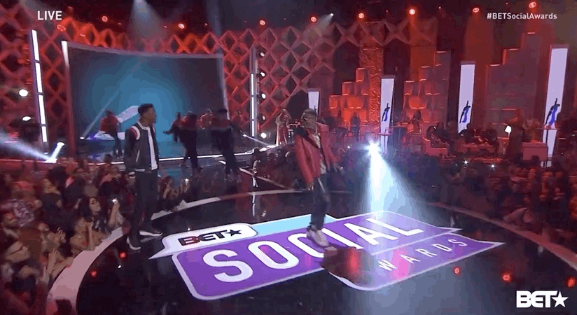
Project: BET Social Awards
Role: Creative Director, Art Director, Copywriter
Network: BET
Overview: I led the creative direction and art direction for the BET Social Awards, overseeing the full campaign from concept to execution. This included developing the complete show package and all consumer-facing promotional assets. The visuals and messaging were designed to reflect the pulse of online culture, blending humor, bold design, and cultural relevance to engage a digitally native audience. I also provided art direction for the set design, helping shape a dynamic, visually striking live broadcast that celebrated the intersection of social media and entertainment.
Project: Rolex – Perpetual Planet
Role: Art Direction, Social Content Design
Overview:
While at JWT, I supported the launch of Rolex’s Perpetual Planet initiative—an ongoing platform that champions modern explorers working to protect the environment.
We created social-first content highlighting these individuals and their missions, positioning Rolex as both a legacy brand and a forward-looking supporter of environmental innovation. The visual direction blended rugged, documentary-style storytelling with elevated design to reflect the precision and prestige of the Rolex brand.
Role: Art Director / Creative Director
Company: BET+
Collaborators: Roderick CD-Copy Jay Ross-Graphic Artist
Production Company: Hartbeat
Overview: Real Husbands of Hollywood returned to BET+ with More Kevin, More Problems, a new six part limited series that brought the franchise back with even more chaos, comedy, and star power.
Contribution: We built a launch campaign designed to generate hype around the return of Real Husbands of Hollywood while emphasizing that this season was officially plused up for BET+. The creative highlighted the show’s exaggerated humor and premium streaming return, making it feel bigger, bolder, and exclusive to the platform.
Impact: The campaign supported awareness for the new season and helped drive sign ups for BET+ by using a fan favorite franchise as a key platform draw.
Project: Sean John Retail Redesign
Client: Sean John
Location: Macy’s Herald Square (Flagship)
Role: Creative Director, Retail Designer, Visual Lead
Overview: Led the full redesign of the Sean John flagship shop at Macy’s Herald Square, establishing scalable visual guidelines for national retail rollout. The update included spatial layout, fixture systems, window displays, and photo/video direction—delivering a refreshed, premium brand experience that honored Sean John’s New York roots.
Client: VH1
Role: Creative Direction, Branding, Promo & In-Show Graphics
Objective: Reboot the iconic Hollywood Squares game show format for a new generation, infused with the energy, humor, and cultural influence of hip-hop.
Contribution: Partnered with designer Fred Sands to bring the visual world of Celebrity Squares to life—from brand identity and promo graphics to in-show visual systems and title treatments. I established art direction cues that informed set design, creating a cohesive visual narrative from marketing through broadcast.
Creative Strategy: Blending nostalgia with a contemporary twist, we injected the show with a bold, culture-forward aesthetic that resonated with the Hip Hop audiences and elevated the game night format. Every element from typography to motion was designed to feel both iconic and freshly relevant.
Impact: Celebrity Squares premiered as one of VH1’s highest-rated new programs, proving the power of culturally resonant design in driving fan engagement and revitalizing classic IP.
Role: Creative Director, Designer, Event Strategist
Company: Combs Enterprises (Sean John)
Collaborators: NBA, Macy’s Herald Square
Talent: John Wall (Brand Ambassador), DJ Enuff (Event DJ)
Overview: To amplify Sean John’s partnership with the NBA during the 2015 All-Star Weekend, we created a suite of high-energy brand activations that blended sport, style, and culture. Centered around our ambassador, John Wall.
Contribution: Led creative direction across all touchpoints—from court activations to retail experiences
Concepted and designed the on-court “Diddy Style: Dress and Dribble” challenge, blending fashion and hoops for live crowd engagement
Oversaw event branding and layout for John Wall’s meet & greet at Macy’s flagship store, with live music from DJ Enuff
Designed all supporting visual collateral, signage, and branded environments
Impact: The activation brought fresh energy to NBA All-Star Weekend while seamlessly embedding the Sean John brand into the culture of the game. The campaign elevated visibility, engaged fans, and reinforced John Wall’s role as the stylish face of the brand.
Project: GQ The Gent x Sean John – Fresh Dressed Screening & Event
Role: Creative Director, Event Designer
Client: Sean John
Partner: GQ’s The Gent
Production: Red Rooster (Catering)
Overview: To celebrate the critically acclaimed documentary Fresh Dressed, Sean John partnered with GQ’s The Gent to host an exclusive screening and influencer event. With Sean John President Jeff Tweedy and Sean Combs featured prominently in the film, the event served as both a cultural moment and a brand alignment opportunity. I led creative direction and event design, producing a stylish, immersive experience that honored fashion’s legacy in hip hop while reinforcing Sean John’s authority in the space.
Contribution:
Creative direction, Event design, Event planning & production, Graphic design
Project: Waldorf Astoria – Stories Begin Here
Role: Art Director, Graphic Designer
Agency: Y&R
Client: Waldorf Astoria
Overview: At Y&R, I helped lead the creative refresh for Waldorf Astoria’s Stories Begin Here campaign. My role focused on art direction and design, developing a cohesive visual system that highlighted the distinct identity of each property within the global portfolio. The work celebrated the brand’s heritage while modernizing its voice across digital and print touchpoints.
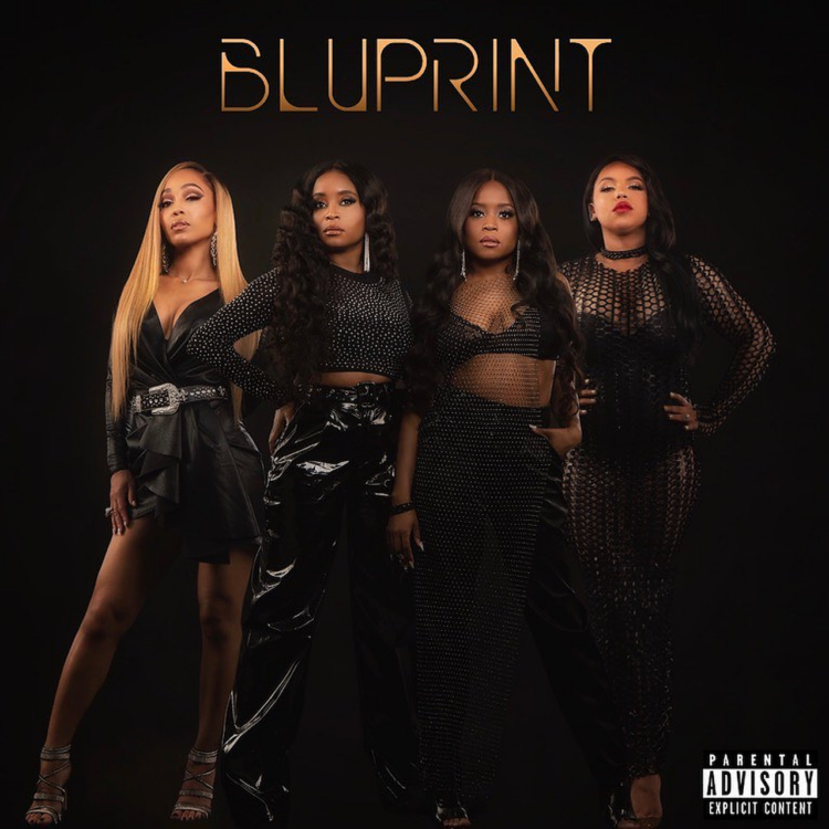
Client: BET/RCA Records
Role: Creative Director & Designer
I led creative for The Encore, a bold BET series where iconic R&B girl group members reunited to form a supergroup and record an album in just 30 days. This campaign was a full-circle moment, blending my passion for music branding and television into one unforgettable launch.
I developed the key art, title logo, graphics package, and full promo campaign, collaborating closely with stylists, editors, and marketing leads to reintroduce these artists with elevated style and attitude. A standout element was the branding for the newly formed group, BluPrint. A sleek identity that honored their legacy while resonating with a new generation of fans.
We extended the branding across social media, streaming platforms, and on-air promos, ensuring visual consistency and impact. This was a uniquely challenging and rewarding project, a true creative lift that celebrated talent, legacy, and style.
Project: Puff Daddy Essentials – HYPEBEAST
Role: Curator, Stylist
Overview: Curated and styled HYPEBEAST’s editorial spotlight on Puff Daddy’s everyday essentials. The feature included an interactive product grid highlighting his personal style and iconic brand influence.
Click here to read and experience the interactive product grid.
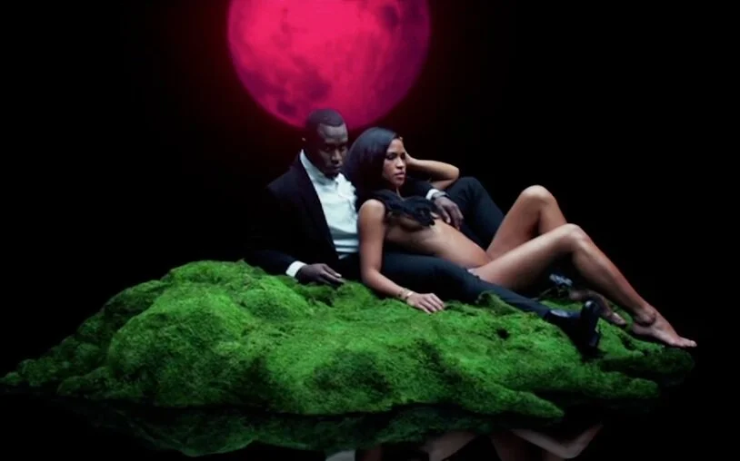
Role: Creative Director, Designer, and Copywriter
Company: Combs Enterprises
Collaborator: Parlux Fragrances
Director: Nabil (Campaign)
While at Combs Enterprises, I led the creative direction, design, and copywriting for the launch of 3AM. A signature Sean John fragrance in partnership with Parlux Fragrances. I was deeply involved across every touchpoint, from the development of the fragrance concept and product design to the advertising, packaging, and retail experience.
Creative Concept: 3AM embodies the raw, unfiltered moment when emotions surface and nothing is left to hide. The brand narrative embraced this energy—elevating it into a story of vulnerability, desire, and unapologetic truth.
Design & Packaging: I designed a sleek, translucent bottle with sharp edges and a vivid flash of red. It’s intended to feel bold, clean, and architectural. The packaging and bottle worked together as a cohesive object of desire, reinforcing the idea that even before the scent is revealed, its presence is undeniable. I also contributed to the development and positioning of the fragrance itself, helping shape the narrative around the scent’s freshness and sensuality.
Campaign: The commercial spot, directed by Nabil, extended the brand's visual and emotional tone into a cinematic expression of late-night intimacy and tension, bringing the world of 3AM to life across film, digital, and in-store placements.
Scope of Work: Brand and fragrance concept development
Bottle and packaging design
Fragrance naming, copywriting, and narrative
Campaign and advertising direction
Retail design and in-store creative
Oversight of commercial direction with Nabil
Role: Creative Director, Photo Director, Copywriter, Designer
Company: Combs Enterprises (Sean John)
Collaborators:
Director/Photographer: Nabil
Retouching: Vision On
OOH Production: Power Moves Inc
Project: 3AM Fragrance – Pre-Launch Teaser Campaign
Overview: To build anticipation for Sean John’s 3AM fragrance, I developed and led an integrated teaser campaign that blurred the line between art and seduction. Designed to provoke conversation and curiosity, the pre-launch phase leaned into a voyeuristic black-and-white aesthetic that was purposefully “leaked” across social platforms, blogs, and IRL via wild postings in major markets.
Contribution:
Conceptualized and executed the campaign strategy and visual identity
Directed photography tone and framing in collaboration with Nabil
Crafted social media rollout and seeding tactics to build viral momentum
Designed OOH and digital graphics for wild posting, press, and social channels
Wrote teaser copy to support the layered, cinematic storytelling
Impact: The campaign’s provocative nature drove buzz across entertainment and fashion media before the official launch, making 3AM one of Sean John’s most talked-about fragrance rollouts to date.
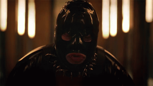
Project: Games People Play Season 2
Role: Creative Direction, Campaign Concept, Visual Strategy, Copywriting
Network: BET
Photography: Elvis Piedra
Graphic Designer:Jay Ross
Stylist/Costume: Wintter
For Season Two of Games People Play, I was tasked with evolving the campaign to match the show’s deeper, darker turn, introducing an elite secret society steeped in secrecy, status, and seduction.
Inspired by the viral “Red Light” TikTok silhouette challenge, we crafted a moody, provocative promo shoot that hinted at the characters’ double lives and obsessions. The red lighting, body-contoured shadows, and sensual posing leaned into the visual language of social media culture while giving it a cinematic, elevated twist.
From wardrobe to graphics, the campaign unapologetically embraced S&M aesthetics. Leather, chains, and body harnesses became part of the styling narrative, while the graphics package mirrored those textures—using glossy blacks, embossed surfaces, and layered matte finishes that hinted at control, secrecy, and power play.
It was ultra-sexy, unapologetically bold, and designed to build hype while signaling a darker, more addictive season ahead.
Client: BET+
Role: Art Director/Campaign Contributor
Average Joe is a dark comedy about Joe Washington. A blue-collar plumber from Pittsburgh whose life is turned upside down when he discovers his late father stole $10 million from the Russian mob.
For the debut season, it was important to ground the series in Joe’s everyday reality and show the emotional pressure he’s under. I led the design for the logo and show title, and contributed conceptually to the overall campaign, helping to define the show’s unique tone—funny, intense, and real.
Our work focused on Joe as a family man facing extraordinary pressure, and the campaign reflected that visually and emotionally.
Key contributions included:
Show logo and title design
Campaign concepts and visual direction for on-air and digital promos
Character-focused imagery
This campaign helped position Average Joe as one of BET+’s most distinctive and grounded original series.
Project: Sean John x Macy’s Exclusive Watch Collection
Role: Creative Direction, Product Design, Graphic Design, Copywriting
Overview: I was tasked with designing an exclusive Sean John watch collection for Macy’s. To honor the brand’s roots, we built the campaign around New York City—Sean John's birthplace and creative heartbeat.
The product and campaign narrative spotlighted signature elements like premium leather and a rare black stone embedded in each timepiece, symbolizing resilience, style, and timelessness. Our design and marketing strategy blended aspirational lifestyle imagery with tactile, material-focused storytelling to reflect the collection’s elevated quality and deep cultural ties.
Production Credits:
Video-Mike Q
Design-Geneva
Project: ALWAYS Sean John
Role: Creative Direction, Copywriting, Graphic Design, Product & Package Design, Digital/Social Strategy
Company: Combs Enterprises
Production:
Photographer – Elton Anderson
Producer/Retouching – Hillyard Productions
“Don’t ask what the meaning of life is, you define it.” – Sean “Diddy” Combs
This campaign explored the concept of self-definition and ambition, inspired by Mr. Combs' own journey. During the ideation phase, I tapped into what makes him eternally culturally relevant—his constant pursuit of greatness. He doesn’t wait for meaning; he creates it.
We positioned Mr. Combs not just as a mogul, but as a symbol of limitless potential—a mindset that inspires creativity, entrepreneurship, and personal evolution. Visually and verbally, the campaign invites audiences to reflect on their own legacy and what it means to sit at the head of their own table.
The result was a lifestyle campaign rooted in aspiration, driven by personal truth, and packaged with cultural sophistication.
Project: Love & Hip Hop: Miami – Season 5
Role: Creative Direction, Graphic Design, Campaign Development
Network: VH1 / Paramount
Overview: For Season 5 of Love & Hip Hop: Miami—one of VH1’s most iconic franchises—we reimagined the campaign and graphics package with a modern, elevated look. As the cast returned and tensions reignited, we leaned into the heat of Miami’s nightlife and culture, delivering a bold visual direction that matched the drama, glamour, and high-stakes energy of the season.
Project: SAY PRIDE
Client: Xfinity (Comcast)
Agency: GoodKid Agency
Role: Art Director, Copywriter, Graphic Designer
Overview: To celebrate Pride beyond the month of June, we created SAY PRIDE—a year-round destination highlighting LGBTQ+ artists and programming available on Xfinity. The campaign centered around a bold “watch anytime” calendar concept, showcasing curated shows and films across the platform. Through vibrant visuals, affirming copy, and digital-first storytelling, we positioned Xfinity as a consistent ally committed to LGBTQ+ visibility 365 days a year.
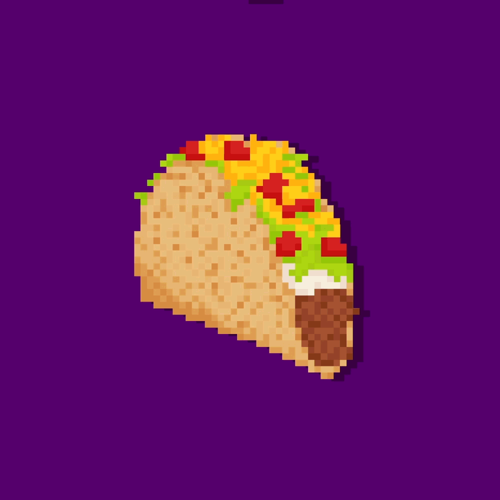
Project: Live Más App Concept
Client: Taco Bell
Agency: Weber Shandwick (Freelance)
Role: Creative Director, Graphic Designer, UI/UX Designer, Copywriter
Overview:During a freelance sprint at Weber Shandwick, I conceptualized and designed an interactive app for Taco Bell that brought the brand’s Live Más ethos to life. Focused on the launch of the Power Menu, the app blended lifestyle content with product education—offering users unique ways to live more boldly through exclusive rewards, lifestyle tips, and customizable menu features. The design prioritized vibrant visuals, intuitive navigation, and brand-aligned voice and tone.
Project: Complex x Sean John – Dream Big Fall 2016
Role: Creative Director, Photo Director, Digital/Social Strategist
Brand: Sean John
Collaborator: Complex
Overview: For the Fall 2016 Dream Big campaign, Sean John teamed up with Complex to amplify the brand’s legacy through bold storytelling and elevated editorial. I led the creative direction and photo strategy for this integrated campaign, crafting visuals and narratives that resonated with a new generation of tastemakers. The digital and social rollout was designed to inspire ambition while honoring the brand’s iconic roots.
Project: Sean John Fall 2015 Campaign
Role: Creative Director, Photo Director
Overview: Spearheaded a visual refresh to reposition Sean John for a modern, premium audience. The campaign marked a shift toward elevated styling and contemporary imagery.
Production:
Photography – Cheryl Fox
Styling – Chloe Lee
Client: Combs Enterprises / EVY of California
Role: Creative Director & Designer
I led the creative for the launch of Sean John Girls, a licensed partnership between Combs Enterprises and EVY of California, a leading manufacturer specializing in girls’ and juniors’ apparel. Collaborating closely with the EVY design team, I worked hand-in-hand with both young girls and their mothers to create a product line that was aspirational, authentic, and aligned with the legacy of the Sean John brand.
From product design to campaign development, I oversaw every visual and strategic asset that supported the brand’s rollout and seasonal refreshes. With a modest marketing budget, I conceived a resourceful, emotionally resonant campaign, anchoring our brand shoot in downtown LA’s factory space and the families’ own homes. This intimate and grounded approach helped position Sean John Girls as both stylish and relatable, embodying the vision Mr. Combs originally established for the brand.
Project: Sean John E-COM Spring 2016
Role: Creative Director, Digital Designer
Overview:
Redesigned all e-commerce shop units for Macy’s and led a reimagining of Sean John’s digital presence. Executed a full banner ad rebrand, moving beyond traditional formats to create bold, elevated visuals that reflected the brand’s premium direction. The campaign resulted in increased online sales and improved click-through rates across digital ad buys.
Contribution: Creative direction, Photo direction, Digital strategy, Graphic design
Project: Sean John Spring 2015 Lookbook
Role: Creative Director, Designer
Overview:
Designed Sean John’s Spring 2015 lookbook for both print and digital platforms, showcasing the season’s collection through elevated styling, sleek layout, and user-friendly design.
Contribution: Creative direction, Photo direction, UI/UX design, Graphic design
The sophisticated Cuban inspired Spring 2017 line was a beautiful collection. I used Cuban top model Dion Smith to role out the line through a series of on-line/off-line activations. My minimalistic approach captured imagery that let lighting tell the story about the warmth of the cuban sun.
CONTRIBUTION: Creative direction, Photo direction, Social strategy, Graphic design, Copywriting
PRODUCTION:
Photography-Alvin Kean Wong
Stylist-Jimi Urquiaga
Studio-MILK Studios
Project: Conrad Hotels & Resorts – The Luxury of Being Yourself
Role: Art Direction, Graphic Designer
Agency: Y&R New York
Client: Conrad Hotels & Resorts
Overview: While at Y&R, I Art Directed and design for a print campaign that celebrated the transformative moments of travel. The campaign positioned Conrad Hotels & Resorts as a luxury destination where guests could reconnect with their most authentic selves. Visually refined and emotionally resonant, the work reflected the brand’s commitment to individuality, sophistication, and self-expression.
Project: GQ September Issue Ad Campaign
Role: Art Direction, Styling, Graphic Design
Company: Combs Enterprises
Brand: Sean John
To extend the impact of our GQ x Sean John influencer event, we leveraged the momentum with a print campaign in the September 2015 issue of GQ. I led styling for the shoot and designed the layout across all print ads, delivering a cohesive and elevated visual narrative aligned with Sean John's premium brand direction.
Project: ENYCE GOLD Fragrance Launch
Role: Creative Director, Product Designer
Company: Combs Enterprises
Partner: Parlux Fragrances
Overview:
Following Combs Enterprises' acquisition of the ENYCE brand, I led the creative for its first fragrance launch in partnership with Parlux Fragrances. I designed the scent, bottle, and packaging to reflect ENYCE’s bold, street-forward aesthetic, while introducing a premium fragrance experience. I also directed the product photography and advertising creative to support the launch across retail and digital platforms.
Contribution:
Creative direction, Product design, Packaging design, Photo direction, Campaign design
Production:
Photography-Elvis Piedra
Project: SKYY Vodka – THINGernet Digital Activation
Role: Art Director, Concept Development
Agency: JWT New York
Overview: To reposition SKYY Vodka for a millennial audience, we tapped into their culture of making, hacking, and constant ideation. The campaign LET’S MAKE THIS A THING inspired a social-first digital activation called THINGernet—a creative platform that encouraged audiences to invent and share their own quirky “things,” bringing a new wave of relevance to the brand.
Contribution:
Concept development, Art direction, Digital strategy, Social activation
Project: She’s Worth More
Client: Save The Children
Agency: JWT
Role: Creative Director, Producer
Overview: While at JWT, I led and produced a global TV commercial for Save the Children to bring attention to the dehumanizing effects of child marriage and gender-based valuation. The campaign, titled #ShesWorthMore, aimed to challenge the cultural and systemic norms that reduce girls’ worth to a bridal dowry—or less. Through emotionally charged storytelling and strategic messaging, the work helped amplify the nonprofit’s mission and drive advocacy on a global scale. #ShesWorthMore
Project: Creative Recharge
Role: Creative Direction, Graphic Design
School: The Creative Circus
Overview: As a passion project during ad school, a few collaborators and I built a fully functioning interactive website designed to recharge your creativity. The experience was playful, unexpected, and immersive—showcasing our collective ability to concept, design, and execute a digital environment from the ground up.
PRESS:
Creativity Online
AdPulp
Brandflakes for Breakfast
The Atlanta Egotist
The Creative Circus
Project: Modern Mime
Collective: GANG
Role: Creative Direction, Concept Development
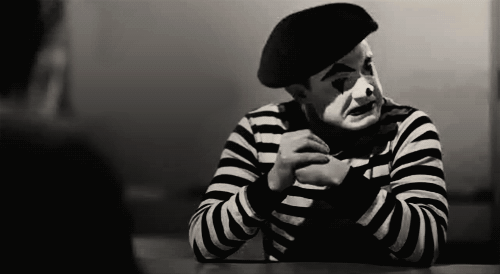
Overview: As part of GANG— a creative collective I formed with copywriter Deanna Director, and Nick Schmidt— we launched a passion project aimed at revitalizing the lost art of miming. Tapping into the legacy of Richmond Shepard , the world’s oldest living mime at the time, we reimagined the tradition with a modern twist, blending performance art with unexpected storytelling and visual experimentation. The result: an unconventional cultural moment that didn’t feel like advertising—and that was exactly the point.
Project: KIMYE Invaders
Role: Creative Direction, UI/UX Design, Graphic Design, Copywriting
Collaboration: Nick Schmidt
Overview: Born from a mix of boredom and cultural obsession, KIMYE Invaders was a self-initiated passion project that reimagined the classic arcade game with a celebrity twist. I led creative direction, UX, and visual design—injecting satire and playful commentary into the pixelated universe of Kim and Ye. Part nostalgia trip, part internet art, the game became a humorous digital escape rooted in pop culture.
PRESS:
kotaku